
Greg Test Short Form Template

Hero block could be updated as follows:
- Title (H1) - Must have
- Links - Optional
- Image - Optional
- Links & Image - Swap order so that links appear directly under title
- Intro text - Optional - WYSIWYG field that is two-thirds width of content area on front-end.
This results in a very flexible hero blocks that crucially moves the jump menu above the fold for users of smaller devices.
Ricktext Block
Add same horizontal line that other blocks have at the top.
WYSIWYG field updated with correct H-styles, text links styles and button style options from the final Figma. Remove ALL redundant options.
Reduce width to 2-thirds of content width to avoid overly long line length (poor legibility)
Dual Content Media Block
Image to the right should allow for any height. Only the width should be fixed. This would allow for square images, which are requested sometimes by Professsional Affiliates.
This is an H3 header
This is an H4 header
This is an H5 header
Why do we only have H4 and H5 as heading options?
Should we not also include H3 if the block title is an H2?... and make sure that block titles are using proper H-tags in the code if currently not.
Accordion Block
Optional WYSIWYG intro
The Accordion Block should include an option WYSIWYG intro that appear below the title and above the first item. Half or 2-thirds width of the content area.
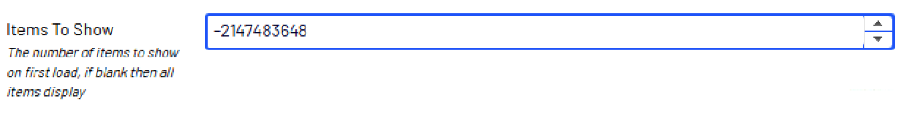
Items to Show field
The Show items counter shows a strange figure if you use the arrows to set the number rather than just type it in. Number should start from 0. Increase arrow should increase numbers from 0 and decrease arrow should never go below 0.
Add Anchor Point
We should have the ability to add an anchor for this block without the need to rely on the 'accordion-block-xxxxxx' hack.
Update WYSIWYG Styles
Update WYSIWYG Styles so that all headings, links and button styles are as they should be (see Figma) and remove all redundant styles).
Card Block
Vertically centre link arrow with textThe heading and the description text should both be optional so that we can stack rows without the need to have any text between them. For example, having two rows of three was ideal when rebuilding the Staff Hub.
The Description should also be WYSIWYG so that we can apply some basic styling and links if necessary without resorting to HTML. This is about building in as much flexibility as possible.
Lastly, please vertically centre the link arrow with the text.

Image Card Item
Image Card Item Description should be optional and WYSIWYG
Carousel Card Block
Vertically centre link arrow with textThe heading and the description text should both be optional so that we can stack rows without the need to have any text between them. <p> The Description should also be WYSIWYG so that we can apply some basic styling and links if necessary. This would also allow for line-breaks. <p> This is about building in as much flexibility as possible. <p> We could merge the Image Card Block and the Carousel: If more than 4 card items are added to the block, then the carousel navigation arrows appear. <p> A merged card block/carousel should also be able to take any type of card, such as Rich Card Items which the carousel does not. <p> Lastly, please vertically centre the link arrow with the text.


Dual Content Block
Icon graphics uploaded to the block should be auto-sized to fit the height or width. (Open to suggestion here)
Should be able to take jpeg, gif, png and svg.
I tried to add icons to this page on the live site, but could not get them to work, so had to use a Dual Content Media Block with an image instead, which is not ideal.
If we allow for subheadings here, then we should allow for H3 also.
Please update all link and button styles as with other blocks.
28%
50%
99%
Events Block
View all eventsEvent Block Comments
We should change this block to include carousel functionality.
Again, if more than 4 events set in the Event Count field, then carousel navigation arrows appear.
Including an optional WYSIWYG description box is also required so that we can add a brief intro where needed.
Lorem ipsum dolor sit amet, consectetur adipiscing elit, sed do eiusmod tempor incididunt ut labore et dolore magna aliqua. Ut enim ad minim veniam, quis nostrud exercitation ullamco laboris nisi ut aliquip ex ea commodo consequat.

Video Block - Doesn't fit
Promo Block - Doesn't Fit


General Content Page (Short Form): About the FDF
The Food and Drink Federation (FDF) is the convenor, adviser and voice of the UK food & drink industry, the largest manufacturing sector in the country.

General Content Page (Short Form): Insights & analysis
We publish economic analysis and insights highlighting the strength of UK food and drink manufacturing and opportunities to drive growth and productivity improvements.
Benefits Grid Block - Doesn't Fit
News Block - Doesn't Fit
NewsNot sure exactly how this block works but not all of it seems to work, such as Type Category

Page Block List - Doesn't Fit
Does this do the same job as the News Block but set to a max of 3 columns? If so, why do we need both? We could have one block that does any type of page import/ We just need to decide on the number of columns, etc... and if it's a carousel or not. Also, this is not a 'list', so re-naming the block would be best and adding an accurate description.
National and regional analysis
National and regional analysis highlighting the importance and economic contribution of our industry.

FDF State of Industry reports
Our quarterly reports highlight the latest trends in business confidence and key policy priorities.

Other economic reports
A collection of some of the other economic research and annual data reports that we have published.
Workplace Parking Licensing Regulations Consultation
Transport Scotland has launched a consultation on workplace parking licensing scheme regulations and guidance. They are seeking opinions on the regulatory framework and supporting guidance that will underpin local authorities’ schemes, should they choose to implement them.